 Scale
Fashion ecommerce / Figma to Shopify
360 Alpha:Shopify Development for a Premium Clothing Brand
- Client
- 360 Alpha
- Industry
- Premium clothing
- Platform
- Shopify / Liquid
- My role
- Frontend & integrations
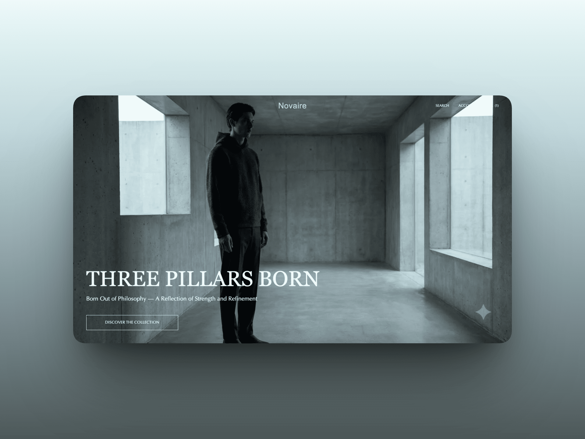
A premium clothing brand website needs to give the products room, but customers still need to find their size, compare colours, and understand what they're buying. A simple design doesn't remove those requirements. It makes the placement of each element more important.
For 360 Alpha, I developed the storefront from a custom Figma design using native Shopify Liquid, CSS, and JavaScript. The work covered the homepage, collection and product pages, supporting pages, product metafields, app integrations, animations, and email templates.
The design direction was simple and premium. My role was to turn that direction into a Shopify storefront with the product information and shopping controls behind it.
The brief: carry a simple design through the shopping experience
The Figma design established the visual direction. Large product photography, restrained navigation, and generous spacing gave the clothing most of the attention.
The development work had to carry that approach beyond the homepage. A customer moving into a collection, opening a product, or reviewing their cart should still recognise the same store.
That meant working through the practical details: how product information sits beside photography, where size selection belongs, how additional information is presented, and how drawers fit into the page. These are small parts individually, but together they determine whether a minimal storefront is clear or simply missing information.
My role and development scope
My work focused on frontend development and connecting the custom interface to Shopify content and apps.
- Converted the supplied Figma design into Liquid, CSS, and JavaScript.
- Developed the homepage, product pages, collection pages, and supporting pages.
- Connected product page content through custom metafields.
- Added motion across the storefront, including the header and product media experience.
- Integrated Klaviyo, a bundle builder, and Judge.me reviews.
- Created order confirmation, shipping confirmation, and marketing email templates.
The supporting pages included About Us, Contact Us, Privacy Policy, and Terms and Conditions. The scope extended beyond the main shopping pages into the information and communication customers encounter around a purchase.
From Figma to native Shopify Liquid
A Figma file shows a designed state. A store has changing products, different content lengths, product options, and customer interactions. Converting the design means accounting for those differences in the implementation.
I used Liquid for the Shopify templates, CSS for the presentation, and JavaScript for interactive behaviour. The storefront was developed within Shopify's theme approach, with custom frontend work translating the supplied design.
For a fashion ecommerce website, this connection matters. A product layout needs to work with the information attached to the actual product. Copying the appearance of a design is only part of the job; the page also needs the right content behind it.
This project is an example of custom Shopify development where the design direction was already defined and the work centred on implementation.
Homepage: photography first, with a clear route into the collection
The homepage uses a large campaign image, a centred 360 Alpha wordmark, and compact navigation. The headline and collection link sit over the image without filling the screen with competing messages.
That gives the opening section a clear purpose: introduce the brand's visual direction and offer a route into the clothing collection.
For this kind of layout, spacing and contrast carry a lot of responsibility. The navigation and collection link need to remain readable against the photograph, while the image still leads the composition. Adding more promotional elements would change that balance.
Collection browsing without a crowded product grid
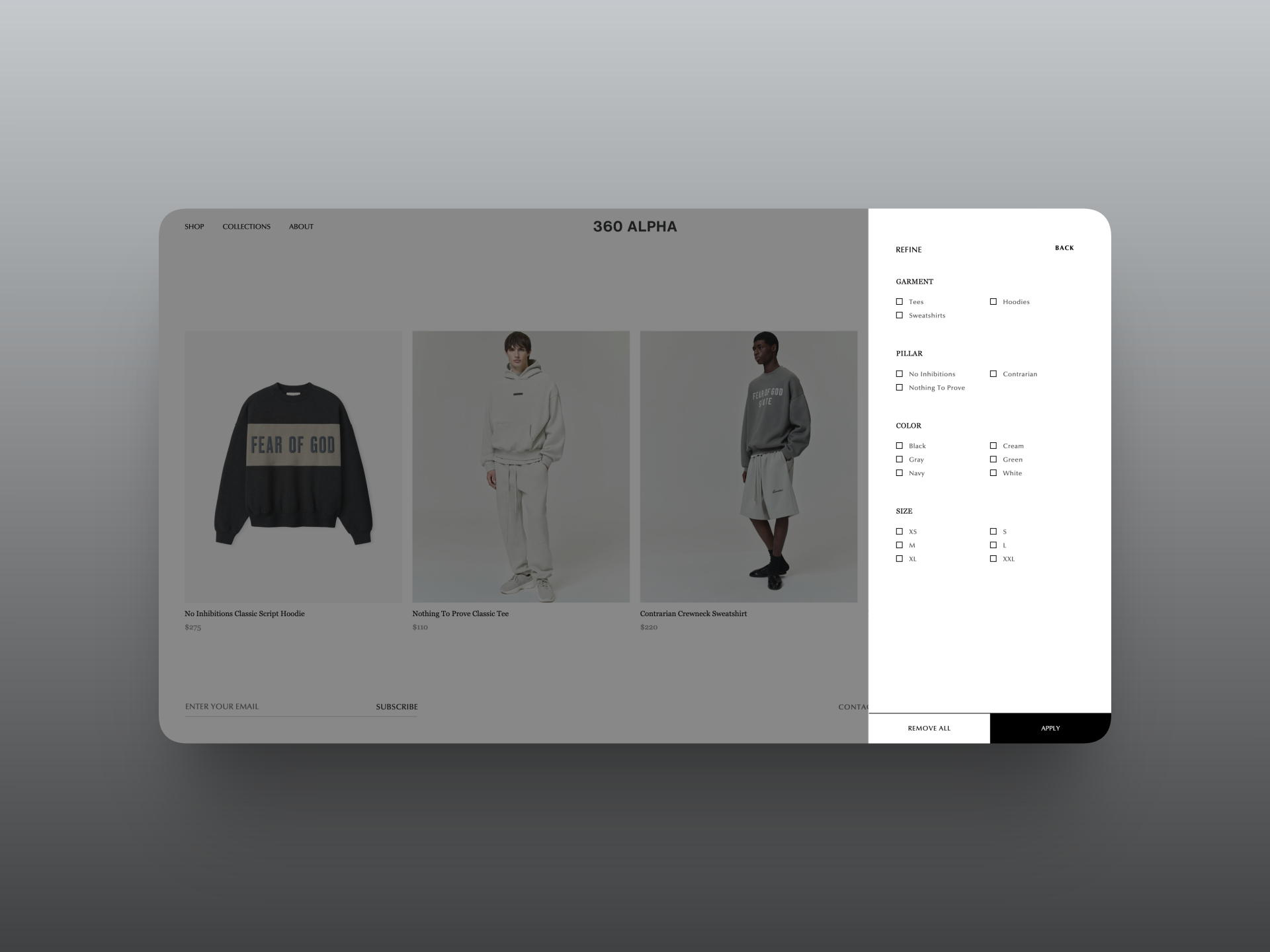
The collection view keeps product imagery prominent, with names and prices beneath the cards. Its filter drawer presents garment type, brand pillar, colour, and size in a separate panel.
This separates two useful activities. Customers can browse the photography when exploring, then open the refinement controls when they know what they're looking for.
The drawer includes Apply and Remove All controls, so the interface makes both narrowing and clearing a selection visible. The collection can stay visually restrained without hiding the available ways to browse it.
The important point is the relationship between the grid and its controls. A clean collection page still needs to help someone find a particular garment.
Product pages: connect the images to the buying decision
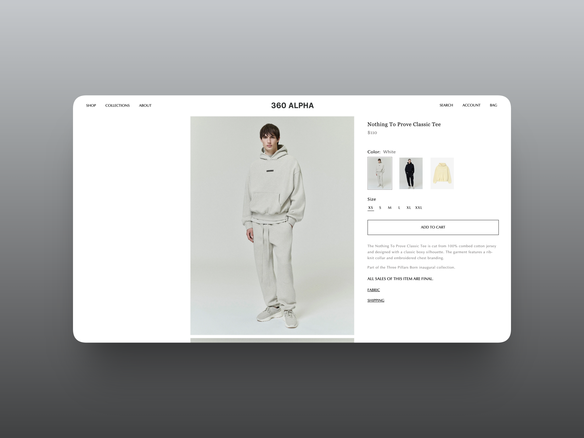
The product page brings together the gallery, product title, price, colour choices, sizes, and Add to Cart button. Descriptive content and fabric and shipping information sit below the main controls.
Clothing photography gives customers one kind of information. Product details and options give them another. The page needs both, with a clear order between them.
Product media gallery
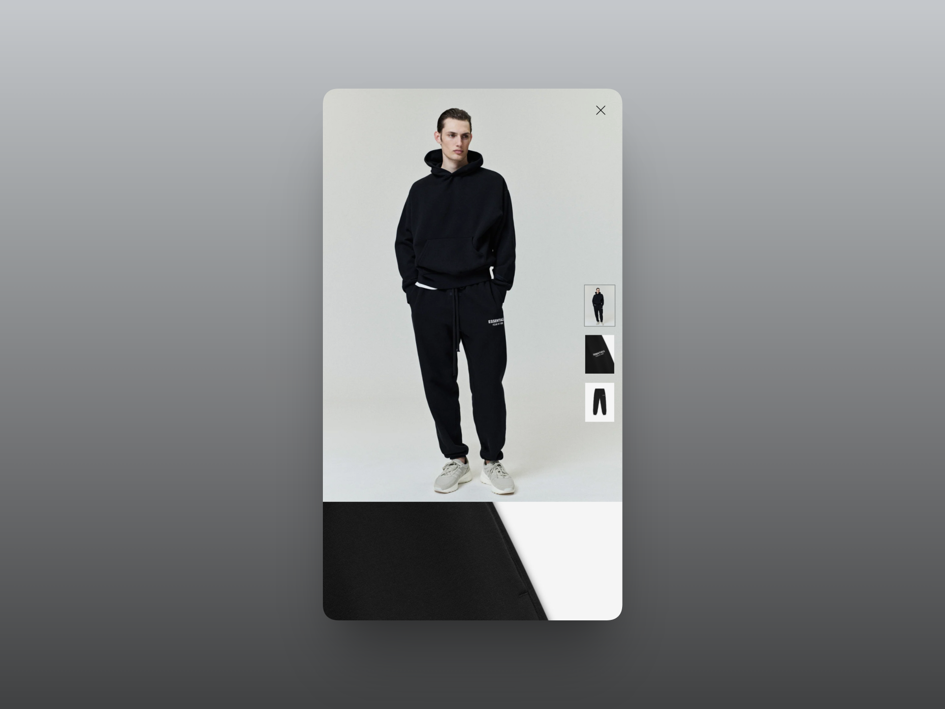
The gallery includes an expanded image view with thumbnails. This gives product photography a separate viewing space while keeping the surrounding product page focused on selection and information.
The colour options use image thumbnails, while sizes use compact text controls. That distinction suits the information being presented: colour is visual, and size is a labelled choice. The interface doesn't need to make both controls look identical to feel consistent.
Custom metafields for product page content
I connected the product page frontend to Shopify through custom metafields. This was part of making the supplied design work with product content rather than treating the page as a fixed layout.
Shopify metafields store additional information, and Liquid can reference that information in a theme. Shopify documents this relationship in its guide to displaying metafields on an online store.
For a clothing store, fabric, fit, and care information are examples of content that can benefit from separate fields. Those are possible uses, rather than a claim about the exact field definitions in this project.
The practical distinction is between the shared presentation and the individual product's content. The template handles how information appears; the product data supplies what appears there.
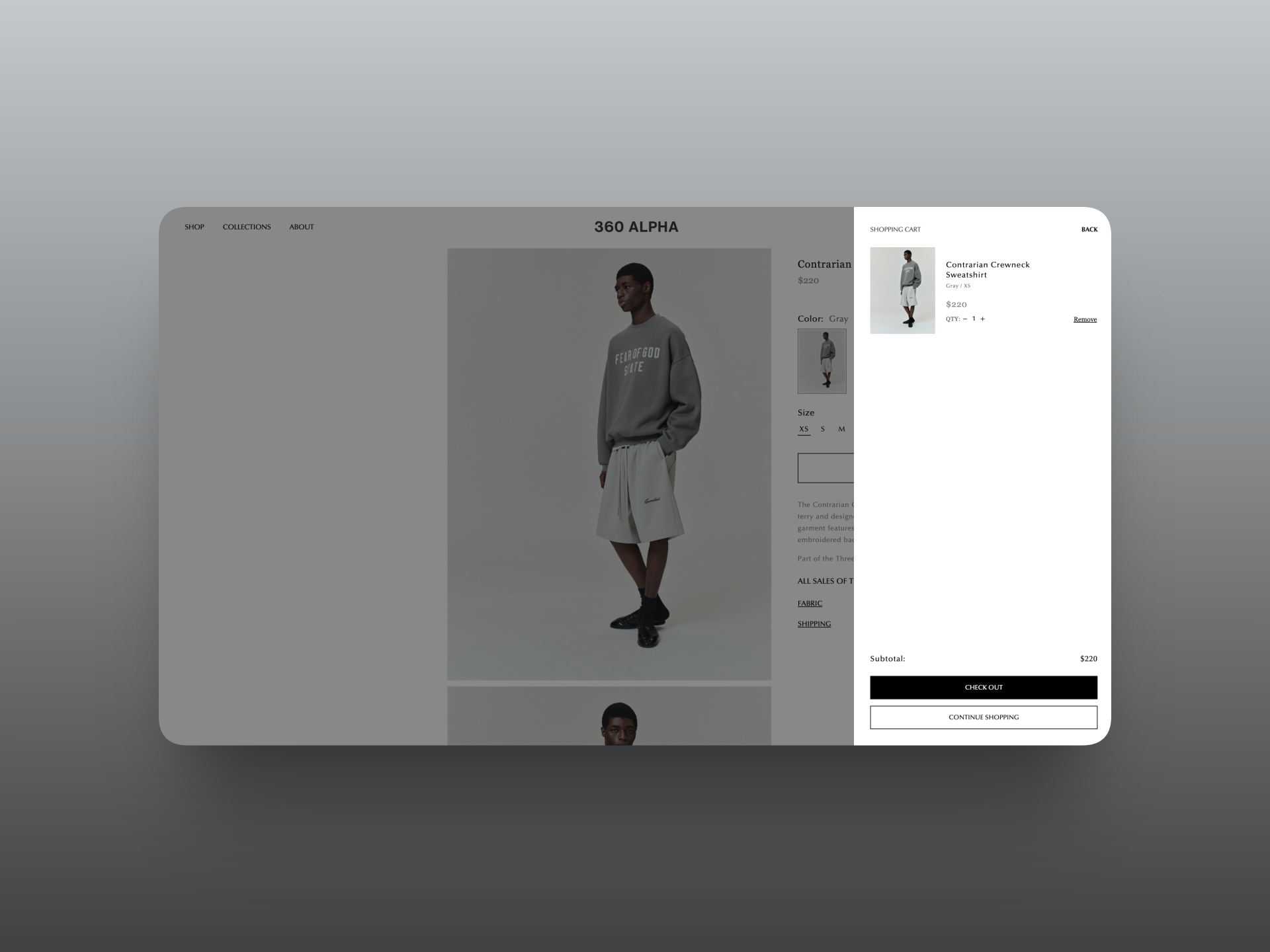
Cart presentation and subtle animation
The cart view uses a side drawer with the selected item, colour and size, quantity controls, removal, subtotal, and checkout action. Continue Shopping provides another visible next step.
Keeping this information together gives the customer a place to review their selection before proceeding. The cart carries through the same restrained presentation as the collection and product pages.
My animation work included Framer Motion and AOS, alongside subtle interactions around the product page, media gallery, and header. Motion was part of the frontend scope, rather than the main subject of the design.
I would keep that distinction in any similar build. An animation can make a transition easier to follow, but it shouldn't make someone wait to use a product control.
App integrations: marketing, bundles, and reviews
The project included Klaviyo, a bundle builder, and Judge.me reviews. Each integration addressed a different part of the store's requirements.
Klaviyo covered the email marketing side. The bundle builder supported the bundle functionality, while Judge.me covered product reviews. Judge.me's widget documentation describes its product review display options.
Using apps also introduces a practical tradeoff. They provide functionality, but their interfaces and scripts become part of the storefront. A minimal design needs those additions considered alongside the custom theme work.
The scope here was integrating the named tools. It doesn't imply that every available feature or automation in those platforms was configured.
Email templates beyond the storefront
I also created templates for order confirmations, shipping confirmations, and marketing emails. The website was one part of the customer experience; the messages around an order were another.
These emails serve different purposes. An order confirmation explains the purchase, a shipping confirmation communicates shipment information, and a marketing email introduces an offer or message. Their content needs to reflect that purpose even when they share a brand's visual direction.
Shopify supports individual notification template edits, including email subject and HTML body changes, as explained in its notification customization documentation.
The development scope therefore included both the storefront interface and the email templates surrounding it.
What this project demonstrates
360 Alpha brings together Figma to Shopify development, custom product content, collection browsing, app integrations, and customer emails within one premium clothing brand project.
The useful takeaway is that a simple storefront still contains detailed development work. The visible interface is restrained, but product data, options, galleries, cart controls, and communication still need their place.
If you have a Figma design for a clothing brand, share your project requirements. The starting point is identifying the pages, product content, and interactions the store actually needs.
Clothing brands & Shopify
Frequently asked questions
What should a premium clothing brand website include?
Start with clear photography, useful product descriptions, size and colour selection, collection browsing, and accessible shipping information. Brand presentation matters, but customers also need enough information to choose a garment and understand their purchase.
Can Shopify support a premium clothing brand website?
Yes. 360 Alpha uses Shopify with a custom frontend developed from Figma. The premium presentation comes from the design, photography, content, and implementation working together. Choosing a platform alone doesn't establish the brand's visual quality.
Can you convert a Figma clothing store design into Shopify?
Yes. That was a central part of this project. I translated the supplied Figma design into native Shopify Liquid, CSS, and JavaScript, then connected product page content through custom metafields and integrated the required apps.
Does a clothing brand need a custom Shopify theme?
It depends on the requirements. I would start with an existing theme when its layouts and interactions already fit. Custom development becomes useful when a defined design or product experience needs changes that the chosen theme doesn't provide.
What belongs on a Shopify clothing product page?
Include photography, price, available options, a clear purchase action, and relevant product details. For clothing, fit, fabric, and care information can answer practical questions. The 360 Alpha product view brings imagery, selection controls, and supporting information into one layout.
How can Shopify metafields help a clothing store?
Metafields hold additional product information that a theme can display. For example, a clothing store could use separate fields for fabric composition or care instructions. In this project, custom metafields connected product page content to the frontend.
How should customers filter an online clothing collection?
Useful filters reflect how customers choose products. Garment type, colour, and size are relevant starting points. The 360 Alpha collection view also includes a brand pillar category, presented with the other filters inside a refinement drawer.
Can a custom Shopify store include product reviews?
Yes. This project included Judge.me reviews. Review functionality should be considered alongside the product layout so that customer feedback has a clear place without overwhelming the product information or purchase controls.
Can Klaviyo be integrated into a Shopify clothing store?
Yes. Klaviyo was one of the integrations included in 360 Alpha. The appropriate marketing setup depends on the brand's requirements. An integration and email templates shouldn't be taken as evidence that every possible marketing flow has been built.
Can Shopify order and shipping emails match the brand?
Yes. Shopify provides editable notification templates. My scope for 360 Alpha included order confirmation and shipping confirmation templates, as well as marketing emails. The message still needs to communicate its purpose clearly after visual customization.
Should a premium fashion website use animations?
Use them where they help an interaction or support the design. Subtle motion can suit a minimal storefront, but more animation doesn't automatically make it feel premium. Product information and shopping controls should remain easy to use.
How much does custom Shopify development for a clothing brand cost?
The scope determines the estimate: page layouts, product content, interactions, app integrations, and email work all matter. This case study doesn't establish a project price. A useful estimate starts with reviewing the design and listing the required functionality.