
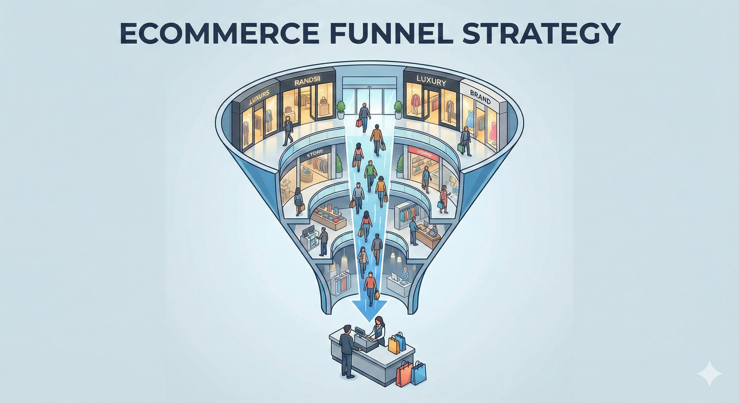
Ecommerce Funnel Strategy: Apply Shopping Mall Psychology to Your Store
Learn how to optimize every step of your ecommerce funnel using retail psychology. Why themes aren't enough and how to customize each touchpoint for maximum conversion.

Summarize with ChatGPT
Click to open ChatGPT with prompt ready - just press Enter!
Your Ecommerce Store Isn't a Website. It's a Funnel.
Walk into any successful shopping mall and you'll notice something:
Nothing is random.
The luxury stores are at the entrance to set the tone. The food court is in the middle to keep you circulating. The changing rooms are at the back of each store, forcing you to walk past every product display.
Those impulse-buy items—gum, batteries, magazines—are always at the checkout counter where you're waiting with nothing else to do.
Small items you grab while waiting. Big ticket items you discover while browsing.
This isn't accident. It's decades of retail psychology, tested and perfected.

Now here's the problem with most Shopify stores:
They treat their website like a brochure, not a funnel.
They pick a theme. Add products. Maybe customize the colors. Done.
But ecommerce isn't about having pages. It's about orchestrating a journey where each step is designed to move customers closer to purchase.
Let me show you what I mean.
The Shopping Mall Blueprint (And Why It Works)
Before we talk about your online store, let's understand why physical retail works the way it does.
The Entrance Strategy: Aspirational First
What malls do: Place luxury brands (Gucci, Apple, Rolex) near the entrance. You might not buy a $3,000 bag, but it sets an aspirational tone. Everything else feels more reasonable by comparison.
Why it works: Anchoring effect. The first price you see becomes your reference point. A $180 dress feels affordable after seeing $3,000 bags.
What most ecommerce stores do: Show random "featured products" or "bestsellers" on the homepage. No strategy. No anchoring.
The Path Strategy: Controlled Discovery
What stores do: Essential items (milk, bread in supermarkets) are placed at the back. You have to walk past everything else to get what you came for.
Changing rooms are at the back of clothing stores. Same principle.
Why it works: Exposure. The longer you browse, the more you discover, the more you buy. Average items per transaction increases with exposure.
What most ecommerce stores do: Make it easy to find what you want immediately (good for conversion on that item, bad for discovery and AOV).
The Counter Strategy: Impulse Buys
What stores do: Small, inexpensive, high-margin items at checkout: gum, candy, magazines, batteries, phone chargers.
You're waiting anyway. Might as well add that $3 item.
Why it works: Low commitment decision when you're already committed to purchasing. 30-40% of shoppers add impulse items at checkout.
What most ecommerce stores do: Nothing at cart/checkout, or aggressive upsells that feel sales-y ("Wait! You need these 10 other products!").
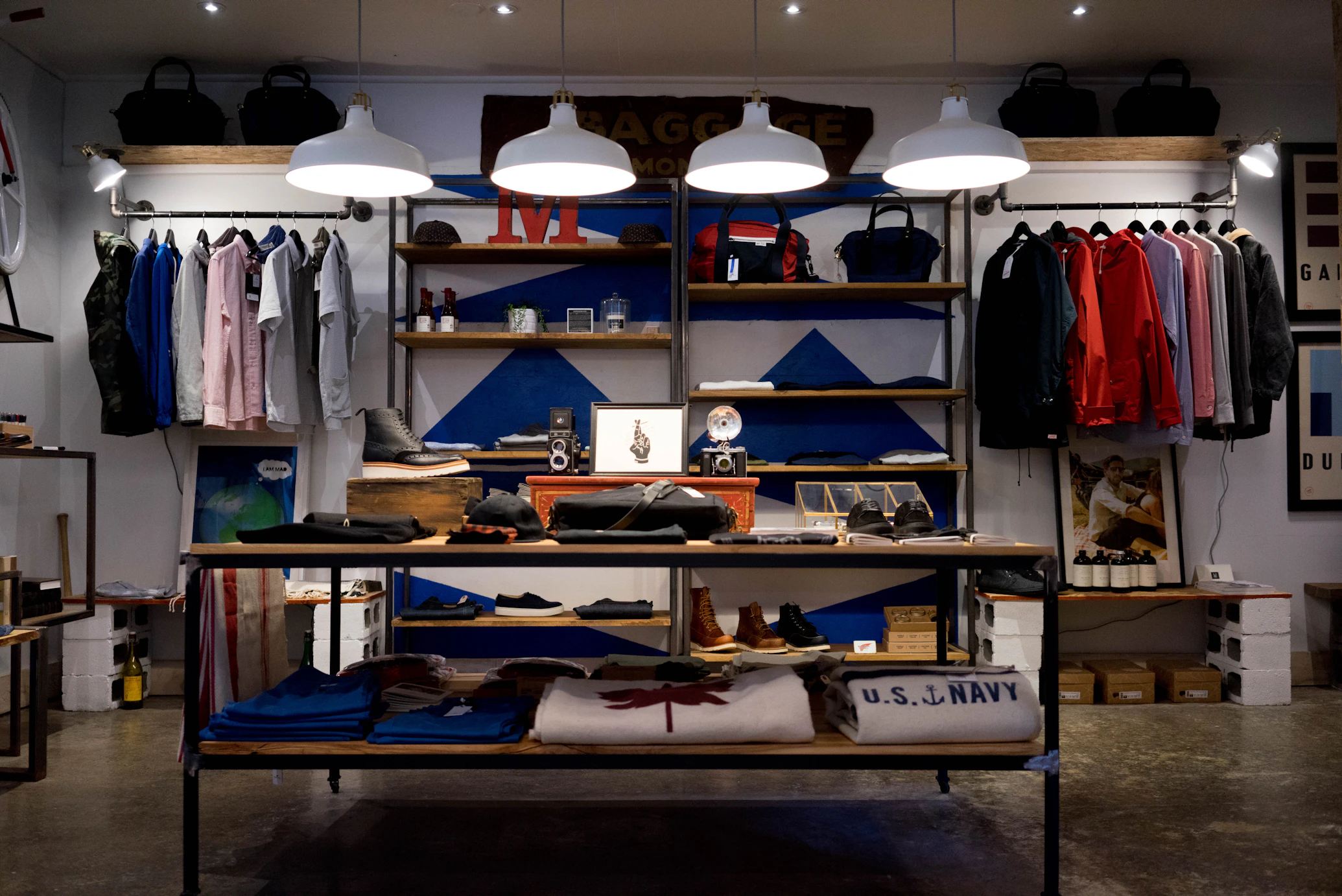
The Sensory Strategy: Creating Experience
What stores do: Lighting, music, scent, product arrangement—all designed to keep you comfortable and browsing longer.
Abercrombie's cologne-filled stores. Apple's minimalist "try everything" layout. Whole Foods' free samples.
Why it works: The longer you stay, the more you buy. And you remember the experience, not just the products.
What most ecommerce stores do: Focus purely on transactions. No personality. No memorable experience. Generic templates.
Your Ecommerce Funnel: Every Step Is a Decision Point
Here's how to think about your store:
It's not:
- Homepage
- Collection page
- Product page
- Cart
- Checkout
It's:
- Hook (Do I want to explore?)
- Browse (Can I find what interests me?)
- Consider (Should I buy this specific product?)
- Commit (Do I add to cart?)
- Impulse (What else do I need?)
- Complete (Is checkout easy enough?)
Each step has a specific psychological goal. And each step needs different optimization.
Let's break it down.
Step 1: The Homepage (The Entrance)
Retail equivalent: Walking into a mall or store entrance
The goal: Set the tone, establish trust, guide to the right section

What Most Stores Get Wrong
They treat the homepage like a catalog:
"Featured Products" (random selection) "Bestsellers" (showing everything) "Shop Now" button (to where?)
No strategy. No anchoring. No guidance.
What Actually Works
1. Aspirational Anchor Products
Show your premium items first (even if they're not bestsellers).
Bad: Random product grid with $40, $180, $60, $95 items mixed together
Good: Hero section featuring $280 premium product "Starting at $80" for entry-level products below
Why: Makes mid-tier products feel like great value. Positions your brand as premium but accessible.
Real example:
A furniture store was showing their $400 bestselling couch first.
We tested showing their $1,800 premium sectional first (which rarely sold).
Result: Average order value increased from $420 to $580.
Customers still bought the $400 couch, but it felt like a value purchase. And some upgraded because the premium option was now visible.
2. Strategic Segmentation
Don't make customers guess where to go.
Bad: "Shop All" button
Good: "Shop by Room" (Living Room, Bedroom, Dining) "Shop by Style" (Modern, Traditional, Minimalist) "Shop by Budget" (Under $200, $200-500, Premium)
Why: Reduces decision paralysis. Customers know exactly where to start based on their need.
3. Social Proof Above the Fold
Bad: Hiding reviews in footer or separate page
Good: "Trusted by 12,000+ customers | 4.8★ rating" Customer photos in hero section "As seen in Forbes, Elle, Architectural Digest"
Why: Establishes credibility immediately. 88% of consumers trust online reviews as much as personal recommendations.
4. Clear Value Proposition
Answer: "Why should I shop here instead of Amazon/competitors?"
Bad: "Welcome to our store!"
Good: "Handcrafted leather goods. Made in USA. Lifetime warranty." "Same-day delivery in NYC. 100% organic. Carbon neutral shipping."
Why: Differentiation. Give me a reason to stay instead of hitting back button.
The Homepage Funnel Goal
Don't sell on homepage. Guide.
Success metric: Click-through rate to collection pages (should be 35-50%)
Step 2: Collection Pages (The Browsing Path)
Retail equivalent: Walking through a store section, browsing product displays
The goal: Help customers discover products they didn't know they wanted

What Most Stores Get Wrong
They dump all products in a grid with basic filters:
- Price (low to high)
- Newest
- Bestselling
That's it.
What Actually Works
1. Curated Collections (Not Just Categories)
Bad: "Women's Tops" (200 products)
Good: "Work-to-Dinner Essentials" "Weekend Casual" "Statement Pieces" "Vacation Ready"
Why: Helps customers browse by intent, not just category. Someone looking for "date night outfit" doesn't want to scroll through 200 tops.
Real example:
A home decor store had collections like "Living Room", "Bedroom", "Kitchen".
We added curated collections:
- "First Apartment Essentials"
- "Cozy Hygge Style"
- "Modern Minimalist"
- "Boho Chic"
Time on collection pages: +64% Products viewed per session: 4.2 → 7.8 AOV: +31%
2. Smart Default Sorting
Don't default to "Featured" or "Newest".
Default to what converts best for that collection.
For "Bestsellers": Sort by actual sales For "New Arrivals": Sort by newest For "Sale": Sort by discount percentage For curated collections: Sort by price (low to high) to show entry point
Why: You're guiding discovery based on purchase intent.
3. Rich Filters (Not Just Basic)
Bad:
- Price
- Size
- Color
Good (Apparel):
- Occasion (Work, Casual, Evening, Athletic)
- Fit (Slim, Regular, Relaxed, Oversized)
- Material (Cotton, Linen, Silk, Wool)
- Sustainability (Organic, Recycled, Fair Trade)
Good (Furniture):
- Room Size (Small, Medium, Large)
- Assembly (Pre-assembled, Easy Assembly, Professional)
- Material (Wood, Metal, Upholstered)
- Style Era (Mid-Century, Contemporary, Traditional)
Why: Help customers filter by what actually matters to them.
4. Visual Hierarchy
Not all products should be equal size.
Feature 1-2 hero products (larger images) per "page" of grid.
Example: Instead of 4x4 equal grid:
- 2 large hero products
- 6 standard products
- Repeat pattern
Why: Guides attention. Creates visual interest. Highlights what you want to push.
5. Lifestyle Context
Bad: Product on white background
Good: Product in use context (styled room, worn outfit, actual environment)
Why: Helps customers visualize the product in their life. Increases emotional connection.
Collection Page Funnel Goal
Encourage exploration, not immediate purchase.
Success metric:
- Products viewed per session (should be 5-8+)
- Product page click-through rate (should be 25-40%)
Step 3: Product Pages (The Sales Pitch)
Retail equivalent: Picking up product, examining it, sales associate explaining features
The goal: Give all information needed to make confident purchase decision

What Most Stores Get Wrong
They show:
- Product image
- Title
- Price
- Description
- Add to cart button
That's the bare minimum. It's not a sales pitch, it's a product listing.
What Actually Works
1. Strategic Information Architecture
Information should be revealed progressively, not all at once.
Above the fold (what they see first):
- Hero product image (high quality, zoom-able)
- Price with any discount shown clearly
- Star rating + number of reviews
- Primary CTA button ("Add to Cart" or "Choose Options")
- Trust signals (Free shipping, Free returns, Secure checkout)
Just below the fold:
- Short, benefit-focused description (3-4 sentences)
- Key features (bullet points, max 5)
- Size/variant selector
- Stock availability (if low)
Further down:
- Detailed description
- Materials and care
- Sizing guide
- Reviews
- Related products
Why: Progressive disclosure. Don't overwhelm. Give enough to decide, with more available if needed.
2. Price Psychology
Bad: $180.00
Good:
$240.00 $180.00 (Save $60)
or
$180.00 (Usually $240 - Limited time)
Even better (if true): $180.00 Compare at: $240 elsewhere You save: $60 + Free shipping ($15 value)
Why: Anchoring and perceived value. The discount needs context to feel significant.
3. Real Urgency (The Changing Room Strategy)
Remember: changing rooms are at the back of stores. You pick up items, carry them through the entire store, then go try them on.
By the time you're in the changing room, you're invested. You've spent time. You've imagined yourself in these clothes.
Ecommerce equivalent:
Don't show urgency at first glance.
Let them browse product page for 15-30 seconds. Then show:
- "Only 2 left in your size"
- "12 people are viewing this now"
- "Usually ships in 1-2 days (high demand)"
Why: They're already invested in the product. Now urgency creates FOMO without being pushy.
Implementation: Use exit-intent or scroll-triggered urgency (appears after engagement, not immediately).
4. Objection Elimination
Think like a sales associate: "What questions will they have?"
Common objections:
- Will it fit? → Sizing guide, fit feedback, model measurements
- Will it look good on me? → Customer photos, multiple angles, videos
- Is it good quality? → Reviews, material details, warranty
- Can I return it? → Clear return policy, "Free returns" badge
- Is this site legit? → Trust badges, security, real reviews
Address these proactively, don't wait for them to ask.
5. Social Proof That Matters
Bad: "10,000 customers love us!"
Good:
- 4.7★ from 247 verified reviews
- Top 3 reviews with customer photos
- Review filters (by size, by rating, verified purchase)
- "86% would recommend to a friend"
- Recent purchase notifications: "Sarah from Austin bought this 2 hours ago"
Why: Specific, verifiable social proof builds trust. Generic claims don't.
Product Page Funnel Goal
Convert browsers to cart-adders.
Success metric: Add-to-cart rate (should be 8-15% depending on price point)
Step 4: Cart (The Impulse Zone)
Retail equivalent: Waiting at checkout counter, seeing gum and magazines
The goal: Increase AOV without being annoying

What Most Stores Get Wrong
They either:
- Do nothing (just show cart items)
- Blast aggressive upsells ("Wait! Buy these 10 things!")
Both are missed opportunities.
What Actually Works
1. The Counter Candy Strategy
Show small, complementary add-ons:
For fashion:
- Adding $180 dress? Show: jewelry ($25), belt ($40), handbag ($95)
For electronics:
- Adding laptop? Show: mouse ($15), laptop sleeve ($30), cleaning kit ($12)
For beauty:
- Adding skincare set? Show: headband ($8), facial tools ($18), travel bag ($12)
Key principles:
- Lower price than cart total (ideally 15-30% of main item)
- Actually complementary (not random)
- One-click add to cart
- Easy to ignore
Why: Low friction, high value. People adding $180 items aren't bothered by $25 add-ons if they're genuinely useful.
Real example:
Jewelry brand selling $200-400 pieces added "Complete your look" section:
- Jewelry cleaning kit ($15)
- Storage box ($25)
- Gift wrapping ($8)
22% of customers added at least one item. Average cart value: +$18 Annual impact: $280K additional revenue
2. Free Shipping Threshold
Bad: "Free shipping on all orders!"
Good: "You're $32 away from free shipping"
Show progress bar. Suggest products to hit threshold.
Why: 62% of shoppers will add items to reach free shipping threshold.
3. Subtle Scarcity
Bad: "⚠️ ITEMS IN YOUR CART ARE SELLING FAST!!!"
Good: "Items in cart are reserved for 15 minutes" "2 people have this item in their cart right now"
Why: Creates urgency without being manipulative.
4. Cart Summary Visibility
Make cart total visible at all times (sticky sidebar or header).
Show:
- Subtotal
- Estimated shipping (if possible)
- Estimated tax
- Total
Why: No surprises at checkout. 48% of cart abandonment is due to unexpected costs.
Cart Funnel Goal
Increase average order value without increasing abandonment.
Success metric:
- Cart → Checkout rate (should be 80-85%)
- Items per order (track the increase)
Step 5: Checkout (The Final Counter)
Retail equivalent: Actually paying at the register
The goal: Make it so easy they can't not complete

What Most Stores Get Wrong
Standard Shopify checkout with:
- 15 form fields
- Manual address entry
- No guest checkout
- Loading time 3-5 seconds
- Only credit card payment
It works. But it's not optimized.
What Actually Works
1. One-Click Options
Enable every fast checkout option:
- Shop Pay (pre-filled for returning customers)
- Apple Pay
- Google Pay
- PayPal Express
Why: Each additional friction point loses 5-10% of customers.
Real data:
Store enabled Shop Pay:
- 18% of checkouts used Shop Pay
- Shop Pay conversion: 87% (vs 64% standard checkout)
- Shop Pay average time to purchase: 0m 28s (vs 2m 45s standard)
2. Guest Checkout (Always)
Never force account creation before purchase.
Bad: "Create account to continue"
Good: "Continue as guest" (default) "Save for next time? Create account" (optional, post-purchase)
Why: 24% of cart abandonment is due to forced account creation.
3. Progressive Disclosure
Don't show all steps at once.
Step 1: Email + Shipping Address Step 2: Shipping Method Step 3: Payment
Only show current step. This feels faster even if it's not.
Why: Reduces cognitive load. One decision at a time.
4. Trust Signals at Checkout
Show:
- Lock icon + "Secure checkout"
- Payment method badges (Visa, Mastercard, PayPal)
- Money-back guarantee
- "SSL encrypted" badge
- Customer service contact ("Need help? Call/Chat")
Why: This is where doubt creeps in. Reinforce trust at the moment of payment.
5. Order Summary Visible
Don't hide what they're buying.
Sticky sidebar (desktop) or collapsible section (mobile) showing:
- Product images
- Quantities
- Total cost breakdown
Why: Reinforces the purchase. They remember why they're buying.
Checkout Funnel Goal
Maximum completion rate.
Success metric: Checkout completion rate (should be 75-85%)
Step 6: Post-Purchase (The Loyalty Loop)
Retail equivalent: Receipt, loyalty card signup, "tell your friends"
The goal: Turn buyers into repeat customers

What Most Stores Miss
They think the funnel ends at purchase.
It doesn't. That's where the real money is.
Customer Acquisition Cost: $60-120 First purchase profit margin: 15-30% Break-even: Purchase 2-3
You don't make real profit until the second purchase.
What Actually Works
1. Immediate Post-Purchase Upsell (Shopify Plus)
After checkout completion, before thank you page:
"Your order is confirmed! ✓ Want to add [complementary product] for 20% off?"
One-click to add. Doesn't require re-entering payment info.
Example:
Supplement brand:
- Main purchase: Monthly subscription ($48)
- Post-purchase offer: Add second bottle for $38 (instead of $48)
- Acceptance rate: 11%
- Impact: +$4.18 per order
2. Thank You Page Optimization
Bad: "Thank you for your order! You'll receive a confirmation email."
Good:
- Order confirmation
- "While you wait..." content (blog posts, how-to guides, UGC)
- Social share: "Share your purchase" (incentive: entry to win $100 gift card)
- Refer a friend: "$20 off for you, $20 off for them"
- "Create account to track order and save preferences"
Why: Thank you page has 40-50% engagement rate. Use it.
3. Email Sequence Strategy
Order confirmation (immediate):
- Order details
- What happens next
- Track order link
Shipping confirmation (+1-2 days):
- Tracking number
- Estimated delivery
- "While you wait" content
Delivery confirmation (when delivered):
- "It's arrived!"
- How to use/care for product
- Ask for review (incentive: 10% off next order)
Post-delivery (+7 days):
- "How is everything?"
- Request photo review
- Related products
Replenishment (if applicable, +30-60 days):
- "Running low?"
- Reorder reminder
- "Subscribe and save 15%"
Why: 30% of revenue should come from repeat customers. Email nurtures this.
4. Loyalty Program
Simple points program:
- 1 point per $1 spent
- 100 points = $10 off
- Bonus points for reviews, referrals, social shares
Why: Customers with loyalty points are 3.5x more likely to make a second purchase.
Why Themes Aren't Enough
Here's the truth about Shopify themes:
They're designed for everyone, which means they're optimized for no one.
Themes give you:
- Generic homepage layouts
- Basic collection grids
- Standard product pages
- Default cart experience
- No post-purchase strategy
They don't give you:
- Strategic product positioning
- Custom collection curation
- Progressive disclosure on product pages
- Smart cart upsells
- Post-purchase optimization
Every store has different:
- Products (physical, digital, subscription)
- Price points ($20 vs $2,000)
- Customers (impulse buyers vs. research-heavy)
- Purchase cycles (one-time vs. repeat)
- Competitive advantages (price, quality, speed, uniqueness)
One theme can't optimize for all of these.
Real Example: Furniture Store Transformation
Let's see this in action.
The Store: Mid-range modern furniture, $400-2,000 per item.
Before (using premium theme, minimal customization):
- Homepage: Featured products grid
- Collections: All sofas, all chairs, all tables
- Product pages: Standard template
- Cart: Just shows items
- Conversion rate: 0.8%
- AOV: $620
After (funnel optimization):
Homepage changes:
- Hero: $1,800 premium sectional (aspirational anchor)
- "Starting at $450" for entry-level pieces
- Segmentation: "Shop by Room" vs "Shop by Style"
- Social proof: Customer room photos
- Clear value prop: "Free delivery + assembly. 90-day returns."
Collection changes:
- New curated collections: "First Apartment", "Living Room Refresh", "Home Office Setup"
- Filters by room size, assembly preference, style
- Default sort: Entry-level pricing first (show accessible prices)
Product page changes:
- Progressive disclosure (key info first, details below)
- Room visualizer: "See this in your space" (AR feature)
- Urgency after 30s: "Only 2 in stock in this color"
- "Complete the room" cross-sells (coffee table with couch)
Cart changes:
- "Add assembly service? ($99)" - 18% uptake
- "Add rug to complete the room?" - 12% uptake
- Free shipping threshold: "Add $78 for free delivery"
Checkout changes:
- Express payment options (Shop Pay, Apple Pay)
- Financing clearly shown: "Or pay $52/month"
- "White glove delivery" upgrade option
Post-purchase:
- Thank you page: "Design tips" content, refer-a-friend
- Email sequence: Assembly guide, care tips, review request
- Replenishment: "Refresh your space" email at 6 months
Results (6 months):
- Conversion rate: 0.8% → 1.9% (+138%)
- AOV: $620 → $890 (+44%)
- Add-on service uptake: $110 per order average
- Repeat purchase rate: 8% → 14%
- Monthly revenue: $480K → $1.1M
They still used a Shopify theme as the base.
But they customized every step of the funnel based on their specific customer journey.
How to Audit Your Own Funnel
Week 1: Map the current journey
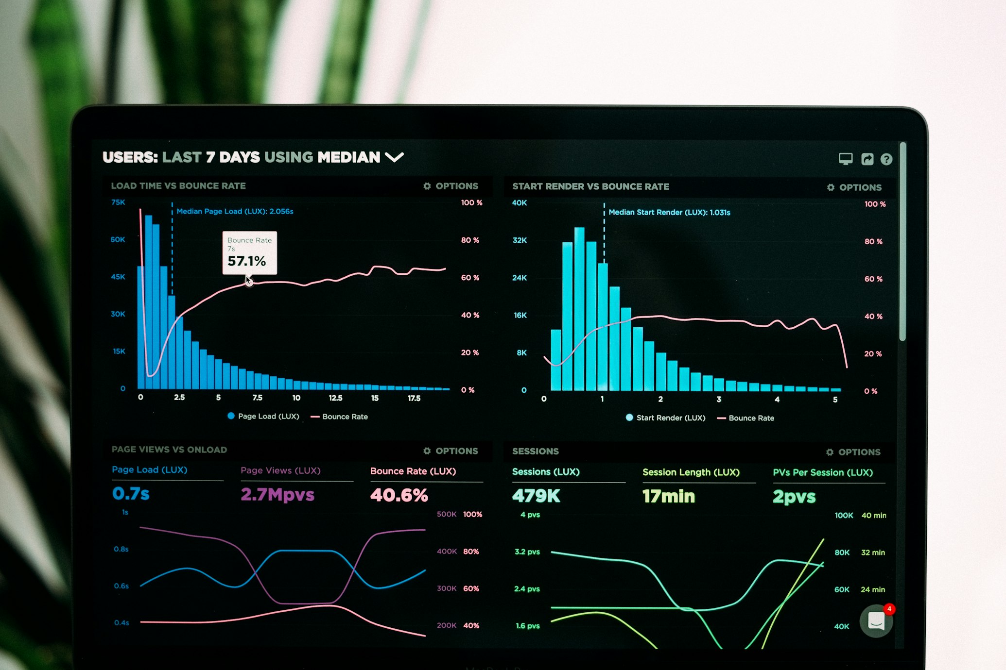
Use Google Analytics 4 and Hotjar/Lucky Orange:
- Where do people enter? (traffic sources)
- Where do they go next? (behavior flow)
- Where do they drop off? (exit pages)
- What do they click? (heat maps)
Week 2: Identify the biggest leaks
Calculate conversion rate at each step:
- Homepage → Collection page
- Collection → Product page
- Product page → Add to cart
- Cart → Checkout
- Checkout → Purchase
Where's the biggest drop? That's your priority.
Week 3: Benchmark against best practices
| Step | Your Rate | Good | Excellent |
|---|---|---|---|
| Homepage → Collection | ? | 35-50% | 60%+ |
| Collection → Product | ? | 25-40% | 50%+ |
| Product → Add-to-cart | ? | 8-15% | 20%+ |
| Cart → Checkout | ? | 80-85% | 90%+ |
| Checkout completion | ? | 75-85% | 90%+ |
Week 4: Prioritize fixes
Focus on:
- Steps with biggest volume (fix homepage before thank-you page)
- Steps with biggest leaks (40% drop is more critical than 10% drop)
- Steps with quickest wins (sometimes simple fixes have big impact)
Common Funnel Mistakes to Avoid
Mistake #1: Optimizing steps in isolation
Improving product page conversion but sending wrong traffic = wasted effort.
Fix the funnel in order: Traffic → Discovery → Consideration → Purchase → Loyalty
Mistake #2: Copying competitors blindly
"They show related products here, so should we."
Maybe. Or maybe their products are different, their customers are different, their AOV is different.
Understand the why, don't just copy the what.
Mistake #3: Over-complicating
Adding 10 steps to checkout "to collect data" = killing conversion.
Every additional step should serve the customer, not just you.
Mistake #4: Ignoring mobile
70% of traffic is mobile. Design for mobile first, desktop second.
Mistake #5: Assuming themes are enough
Themes are starting points, not solutions. Customize for your specific funnel.
Implementation Roadmap
Phase 1: Foundation (Weeks 1-2)
- Install analytics (GA4, heat maps)
- Map current funnel
- Identify biggest leaks
Phase 2: Quick Wins (Weeks 3-4)
- Enable Shop Pay, Apple Pay, Google Pay
- Add guest checkout
- Show shipping costs early
- Improve product images
Phase 3: Strategic Changes (Weeks 5-8)
- Redesign homepage (aspirational anchor, segmentation)
- Create curated collections
- Optimize product page layout
- Add smart cart upsells
Phase 4: Advanced Optimization (Weeks 9-12)
- Custom checkout (if doing $1M+ annually)
- Post-purchase sequence
- Loyalty program
- A/B testing
Phase 5: Ongoing (Monthly)
- Review funnel metrics
- Test one element per month
- Iterate based on data
Final Thoughts
Your ecommerce store isn't a collection of pages.
It's a carefully orchestrated journey where each step serves a purpose:
Entrance: Set the tone, guide exploration Path: Encourage discovery, build interest Consideration: Provide information, eliminate doubts Commitment: Remove friction, make it easy Impulse: Increase value, not pressure Completion: Secure the sale, start the relationship
Shopping malls figured this out decades ago.
The stores that win online are applying the same psychology, adapted for digital.
Themes give you pages.
Custom funnel design gives you conversion.
Need help optimizing your funnel? We specialize in custom Shopify development that's designed around your specific customer journey.
Schedule a funnel audit or see our conversion optimization work.
Frequently Asked Questions
What is an ecommerce funnel?
An ecommerce funnel is the step-by-step journey a customer takes from first visiting your store to making a purchase (and beyond). It typically includes: Homepage → Collection Page → Product Page → Cart → Checkout → Post-Purchase. Each step has different goals and should be optimized differently.
How is ecommerce like a shopping mall?
Shopping malls use proven retail psychology: luxury brands at the entrance (anchoring), essential items at the back (controlled discovery), impulse items at checkout, and changing rooms positioned to maximize product exposure. Successful ecommerce stores apply these same principles digitally through strategic product placement, curated collections, and optimized customer journeys.
Why aren't Shopify themes enough?
Themes are designed for everyone, which means they're optimized for no one. Every store has different products, price points, customers, and purchase cycles. A furniture store selling $2,000 sofas needs a different funnel than a clothing store selling $40 t-shirts. Custom optimization based on your specific customer journey always outperforms generic themes.
What's the most important part of the ecommerce funnel to optimize?
Start with the biggest leaks. Use Google Analytics to find where you lose the most customers. Often it's: (1) Wrong traffic entering the funnel, (2) Poor product discovery, or (3) Painful checkout. Fix the step with the biggest drop-off first, as it will have the biggest impact.
How long does it take to optimize an ecommerce funnel?
Quick wins (enabling express checkout, showing shipping costs early) can be implemented in days. Comprehensive funnel optimization (homepage redesign, curated collections, custom checkout) typically takes 8-12 weeks. You should see measurable improvement within 2-4 weeks of starting.
What conversion rate should I aim for at each funnel step?
Benchmarks vary by industry, but generally: Homepage → Collection: 35-50%, Collection → Product: 25-40%, Product → Add-to-cart: 8-15%, Cart → Checkout: 80-85%, Checkout completion: 75-85%. Track your current rates and focus on steps performing below these benchmarks.
Should I optimize for mobile or desktop first?
Always mobile first. 70%+ of ecommerce traffic is mobile, and mobile typically has lower conversion rates with more room for improvement. Design the entire funnel for mobile, then enhance for desktop—not the other way around.
How do I add impulse buys without being annoying?
Follow the 'counter candy' principle: show small, complementary items (15-30% of cart value), make them one-click add-ons, and keep them relevant. For example: jewelry with dress, charger with laptop, travel bag with skincare. Avoid popup interruptions or aggressive upsell messaging.

Written by ScaleFront Team
The ScaleFront team helps Shopify brands optimize their stores, improve conversion rates, and scale profitably.
Get in touch →Get Shopify Tips in Your Inbox
Join 1,000+ store owners getting weekly insights on Shopify optimization, conversion tactics, and growth strategies.
No spam. Unsubscribe anytime.
Need Expert Help with Your Shopify Store?
Get a free consultation with our Shopify optimization experts. We have helped dozens of brands improve their store performance and increase conversions.
Related Articles

The Complete D2C Conversion Playbook: 20 Strategies From Brands Doing $100M+
Complete D2C conversion guide with 20 strategies from brands like Glossier, Allbirds, and Gymshark. Learn how to capture attention, reduce friction, and drive repeat purchases.

How to Hit 6-7% Conversion Rate on Shopify: CRO Strategies That Work
Complete CRO playbook for Shopify stores. Increase conversion rate to 6-7% and AOV to $75+ with gender-specific landing pages, checkout optimization, and trust elements.

How To Do an Ecommerce CRO Audit in 6 Steps (Complete Guide)
Learn how to conduct a comprehensive ecommerce CRO audit. 6-step framework with tools, checklists, metrics, and real examples. Increase conversion rates systematically.