
How to Improve Your Shopify Product Page for More Sales
Learn how to improve Shopify product pages with better images, variant selectors, add-to-cart buttons, product details, and practical CRO testing.
Last updated:
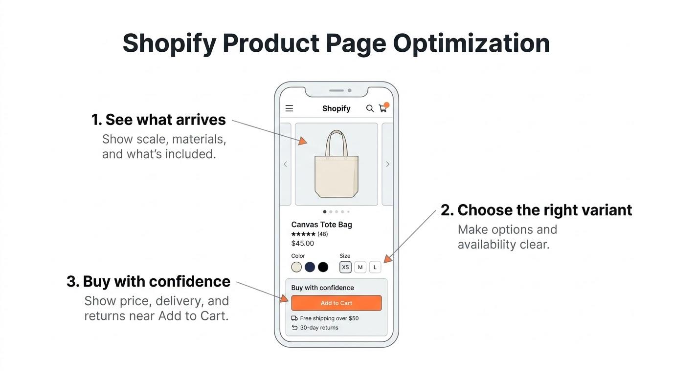
Shopify product page optimization means improving the page where a shopper decides whether to buy. Start by checking whether a shopper on a phone can see what they’ll receive, pick an available variant, understand the price and delivery terms, and add the right item to their cart. Fix any broken step before changing the layout or installing another app.
Open one of your product pages and think about what a customer still needs to check before buying. Can they find their size? Can they see the product from another angle? Can they tell when it will arrive and whether they can return it? Someone can be interested in the product and still leave if the page makes those answers hard to find.
This is where I would start with Shopify product page optimization. You might already have the right theme and apps. The problem can be as small as a color selector that leaves the old image in place, a description tucked away in a tab, or an Add to Cart button that leaves the customer guessing whether it worked.
We'll go through the main parts of the product page, what you can improve using the features Shopify already gives you, and when the work needs a developer.
First, Find Out What's Wrong With Your Product Page
Before you touch the design, open the store on a phone and try to buy something. You already know where things are because you work in Shopify Admin. A first-time customer has to work from what the page shows them, so go through the purchase the way they would.
Can you tell what the product is right away? Can you see which sizes or colors are available? If you choose another option, does the price update? Once you tap Add to Cart, can you tell what happened?
Then check the data. A product page that gets plenty of visits and very few adds to cart is worth looking at. The layout is one possible cause. The product itself, its price, whether it's in stock, and where the traffic comes from can all affect the same number.
You can use Shopify Analytics, GA4, and tools like Microsoft Clarity to narrow down where to look. Check mobile and desktop separately. This is especially useful if you already see the same product performing differently on the two types of device.
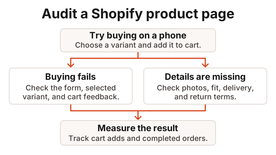
If you need help narrowing down where shoppers get stuck, start with a Shopify conversion audit.
1. Improve Your Product Images and Gallery
Think about what someone could check if they were looking at the product in a physical store. The gallery should help them check those same things online.
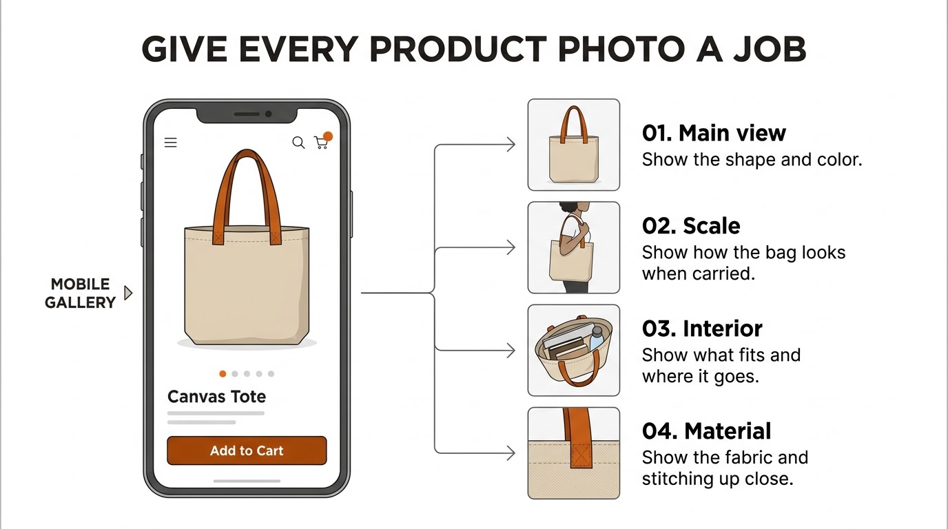
Suppose you sell a handbag. A front-facing studio photo shows the design. The customer still needs to know how big the bag is, how it looks when someone carries it, and what they can fit inside. A photo of someone carrying it, a shot with the bag open, and a close-up of the material each answer a different question.
For a technical product, I would check compatibility before adding another lifestyle photo. For a charger, show the connector and make it clear which devices it supports. For a gift set, show the exact items the customer will receive.
Baymard's research supports giving shoppers informative images and making the gallery easy to explore. If you're deciding what to change, I'd put more weight on those usability findings than on a claim that a fixed number of photos will automatically increase conversions. See Baymard's product page research.
Can Customers Tell What's in the Mobile Gallery?
Some Shopify galleries only show a row of small dots below the main image on mobile. A customer can swipe, but the dots don't tell them whether the next slide is a close-up, a size reference, or a video. If your theme supports thumbnails, try showing them so customers can go straight to the image or video they need.
If the gallery is long, make it clear that more thumbnails are available beyond the ones on screen. Keep product videos discoverable from the gallery so the customer doesn't have to look halfway down the description to find them.
Shopify supports images, videos, and 3D product media. Check the built-in support before adding a separate 3D app. A customer buying furniture might benefit from being able to inspect it in 3D. A simple stationery item may get little benefit from loading a heavy model.
How Should the Main Product Image Load?
On many product pages, the main image is the Largest Contentful Paint (LCP) element. If you lazy-load that image, the browser can take longer to display the part that makes the page feel ready.
Shopify recommends using the image_url and image_tag filters to generate image URLs and markup. This also saves you from having to construct the CDN URLs by hand. In the section that controls the main gallery, replace the markup for its primary image with the snippet below. Match the desktop size to the gallery’s actual width and use the code only where the gallery is visible on page load.
{% assign hero_image = product.selected_or_first_available_variant.featured_image
  | default: product.featured_image %}

{% if hero_image != blank %}
  {{ hero_image
    | image_url: width: 1600
    | image_tag:
      widths: '400, 600, 800, 1200, 1600',
      sizes: '(min-width: 990px) 50vw, 100vw',
      loading: 'eager',
      fetchpriority: 'high',
      preload: true
  }}
{% endif %}
Render this snippet once inside the main gallery with {% render 'product-gallery-primary', product: product %}. Retain the gallery’s existing wrapper and controls so the theme can still change the visible image when the variant changes. Keep the rest of the gallery in place. Images below the initial viewport can usually load lazily. If you preload the entire gallery, those images compete for the same bandwidth. Check which image actually counts as LCP in PageSpeed Insights before changing what gets priority.
See Shopify's image performance guidance.
2. Make Size and Color Selection Easier
Suppose you sell a shirt in five sizes. With a dropdown, the customer has to open it before they can see whether you have their size. For a small set of sizes, visible buttons let them check all the choices at once. You can do the same with color swatches. Give each swatch a clear label so customers can identify it even if they can't distinguish it by color.
Before installing an app, go to Online Store → Themes → Customize and open the product template. Some themes already have a setting for variant pills or buttons in place of dropdowns.
When I check a variant picker, I look for these things:
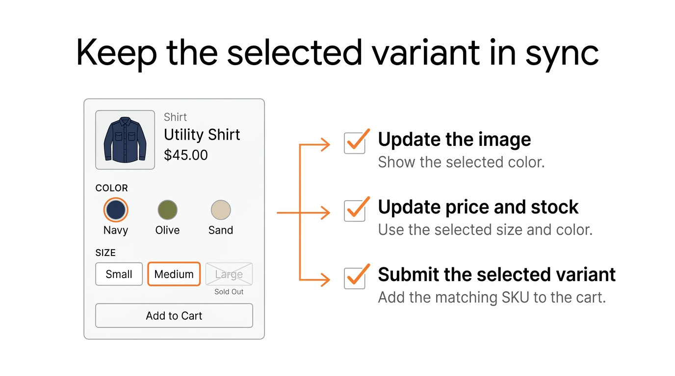
- Keep unavailable options visible and make it clear why the customer can't buy them.
- Update the price, image, and purchase state when the variant changes.
- Make the labels and controls big enough to tap comfortably on a phone.
- Make it clear which option is selected, including when someone uses a keyboard or screen reader.
What Changes With Shopify’s 2,048-Variant Limit?
Shopify supports up to 2,048 variants per product and up to three options. The Liquid product.variants array has a separate limit. It returns up to 250 variants.
An older theme customization might use product.variants or {{ product | json }} to put every variant into JavaScript, then look up the customer's selection in the browser. If the product has more than 250 variants, the browser may be missing combinations even though Shopify Admin shows them all.
Use product.options_with_values and the product_option_value object to render the choices. When the customer changes an option, the theme can request fresh HTML through the Section Rendering API using ?option_values=. Shopify works out which combination is selected, so the browser can avoid loading the entire variant list first.
For a working implementation, follow Dawn’s variant picker alongside its product section update logic. Read both before changing a picker. The option controls send the selected option-value IDs, and the update logic keeps availability, price, media, and the product form in sync. Test a direct variant link, a sold-out combination, and an option selection that has no matching variant.
If you have a product with hundreds of combinations, I would use a compatible modern theme or ask a developer to adapt the existing variant system. Adding a second picker leaves you with two sets of controls to keep in sync.
See Shopify's variant limits and its guide to supporting high-variant products.
What About Custom Color Swatches?
Shopify supports reusable category metafields for options like color. When native swatch data is available, the theme can read it from product_option_value.swatch.
Custom materials, fabric patterns, and metaobjects you create separately may not have that same native swatch data. Suppose you sell furniture with your own fabric finishes. You may need to map each option value to the color or image reference you've stored so the theme knows what to display.
I'd check what your product options and theme already support before deciding whether a swatch app will handle the type of swatch you need.
3. Make the Add to Cart Button Clear and Reliable
Make the Add to Cart button easy to find, then test what it actually does. I'd spend more time checking that the correct variant reaches the cart and that the customer knows it worked than picking a button color.
If the size a customer selects is sold out, show that before they try to add it. If the size is available, check that the form adds the selected variant. A common thing to look for is whether it still submits the default variant after the customer changes an option.
When the add succeeds, give the customer feedback. Open the cart drawer, show a confirmation, or send them to the cart page. If nothing on the page changes, they may have to check the cart themselves to see whether the product was added.
Should You Add a Sticky Add to Cart Button?
A sticky Add to Cart button stays on screen once the customer scrolls past the main purchase button. That can help on long mobile product pages where customers scroll down to look at details or read reviews.
I'd test whether it helps on your store. The research doesn't establish that a sticky button increases conversions for every store.
Check whether the theme already has a sticky-cart setting. If it doesn't, one simple way to build it is to show a second button once the original is out of view. Have that button submit the existing product form so there is still one place that controls which variant is selected.
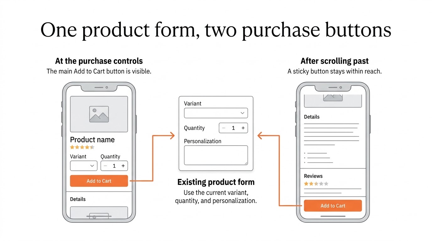
Create the three files in the tabs. In the main product section, render the snippet outside the product form with {% render 'sticky-add-to-cart', product: product, product_form_id: product_form_id %}. Use the same form ID variable that the theme passes to its product form. The example targets a Dawn-style submit button with type="submit" and name="add". Adapt that selector and the button translation key if your theme uses different markup or locale keys.
{{ 'sticky-add-to-cart.css' | asset_url | stylesheet_tag }}
<script src="{{ 'sticky-add-to-cart.js' | asset_url }}" defer></script>

<sf-sticky-buy
  class="sf-sticky-buy"
  data-form-id="{{ product_form_id | escape }}"
  hidden
>
  <span class="sf-sticky-buy__title">{{ product.title | escape }}</span>
  <button type="button" data-sticky-submit>
    {{ 'products.product.add_to_cart' | t }}
  </button>
</sf-sticky-buy>
The sticky button clicks the theme's original submit button, so the existing form supplies the current variant, quantity, selling plan, and line item properties. The theme also keeps control of validation, cart drawer updates, and errors. Test sold-out variants, rapid variant changes, subscription selections, and required personalization fields. Check that the bar leaves enough room for mobile navigation and cart controls. See Shopify's product form guide.
For more advanced Ajax cart behavior, see Shopify's Ajax Cart API and Section Rendering API. Use Shopify's locale-aware routes so you don't have to hardcode each cart URL.
4. Show Price, Shipping, and Return Information Near the Purchase Button
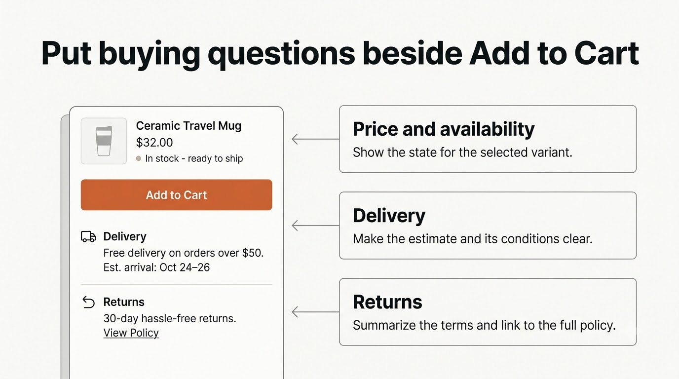
Sometimes all the information is already on the site. The problem is where the customer has to go to find it.
Suppose someone is about to buy a shirt and wants to know if they can return it when the size is wrong. If they have to go to the footer, open a separate returns page, and then come back to the shirt, that's a lot of work for a simple question.
Put a short, accurate summary near the purchase button. Depending on the product, that could include the current price, available stock, shipping options, an estimated delivery range, and a link to the return policy.
Check the actual conditions before writing “Free shipping on every order” or “Easy 30-day returns.” The customer's location can affect the promise, and some products have special shipping restrictions or aren't eligible for returns.
Use Metafields for Product-Specific Information
If the dimensions, materials, care instructions, or compatible devices change from one product to another, you can store that information in Shopify product metafields.
Create the product metafield definition in Shopify Admin and fill in the value for each product. If your theme supports dynamic sources, you can then connect that field to a block in the Theme Editor.
A developer can also show a plain-text metafield in Liquid. For example, suppose you create a text metafield with the namespace and key custom.care_instructions:
{% assign care = product.metafields.custom.care_instructions.value %}

{% if care != blank %}
  <details class="product-care">
    <summary>Care instructions</summary>
    <p>{{ care | escape }}</p>
  </details>
{% endif %}
With this setup, the merchant can change the care instructions in Shopify Admin without editing the theme template.
If you use a rich text metafield, render the metafield object with metafield_tag so formatting and links come through. Also check whether the information belongs to the product or to a specific variant. If dimensions or delivery notes change with the variant, use the appropriate variant metafields and make sure the page updates when the customer selects another variant.
Show Unit Pricing When It Matters
If you sell by weight or volume, showing the price per unit alongside the selling price helps customers compare different pack sizes. Shopify supports unit prices on eligible variants.
{% assign current_variant = product.selected_or_first_available_variant %}

{% if current_variant and current_variant.unit_price_measurement %}
  <p class="product-unit-price">
    {{ current_variant.unit_price
      | unit_price_with_measurement: current_variant.unit_price_measurement }}
  </p>
{% endif %}
Update the unit price when the selected variant changes, just as you would the main price. If you only render the snippet on the initial page load, the customer may see the unit price for the old selection.
5. Write Product Descriptions That Answer Real Questions
A description can say “premium quality” and “perfect for everyday use” without telling the customer anything they can use to make a decision. Start with what the product does, who it's suitable for, what comes with it, and what someone needs to know before they buy.
If you sell a desk lamp, give the dimensions, explain the light modes and power requirements, and say whether a bulb is included. For skincare, show the ingredients, how to use the product, and the pack size. For clothing, explain the material, how it fits, and how to wash it.
Put the key information first. You can use clear headings or vertically stacked accordions to organize the rest without making someone read through one large paragraph.
Baymard found usability issues when horizontal tabs hid important product information. If your page uses tabs, test whether shoppers can find the sizes, specifications, delivery details, and reviews they came for. How well those tabs work depends on whether people can find and use them.
If the only reason to add more copy is to fit in keywords, I'd spend that time answering the questions customers are likely to send to support.
6. Add Reviews and Trust Information Without Cluttering the Page
A rating tells the customer how other people scored the product. The reviews themselves can tell them what to expect when they buy it. If you sell clothing, someone describing how it fits may be more helpful than a star rating. For a home product, customer photos may give a better sense of the actual size and appearance than studio photos.
If your review app has rating filters, photo reviews, and merchant replies, try them on a phone and make sure customers can use them comfortably. Keep the reviews somewhere a shopper can find them, especially if the theme puts them in a tab.
Use genuine feedback. Avoid fake testimonials, artificial review counts, and countdown timers that restart when someone reloads the page. These can create urgency while giving the customer inaccurate information.
I would give the customer a few clear, accurate details about delivery, warranty, or returns. Those answer more of their questions than a long row of generic trust badges.
7. Check Your Product Page on Mobile
A product page can look good on desktop and still be awkward to use on a phone. The gallery might take up most of the screen, a banner might push the price too far down, or the swatches might be so close together that you tap the wrong one. If you use a sticky Add to Cart button, see whether it covers the last line of an accordion or overlaps the chat widget.
Use a real phone as well as browser developer tools. Try a product with a long title, a sale price, multiple variants, or a sold-out option. Also go through the page without a mouse and check that you can see where the keyboard focus is.
Variant buttons and other interactive controls need enough space to tap comfortably. Shopify recommends checking both target size and spacing. 44 × 44 CSS pixels is a useful touch target, but check how much of that area the customer can actually tap and how close it is to the next control.
Watch Core Web Vitals as you make changes. Google's recommended thresholds are LCP at or under 2.5 seconds, INP at or under 200 milliseconds, and CLS at or under 0.1, measured at the 75th percentile of real-user visits. Check the numbers after a redesign. See Google’s Web Vitals thresholds and our Shopify speed troubleshooting guide. A cleaner layout can still load or respond slowly.
8. Which Shopify Apps Are Worth Considering?
Open the Theme Editor and check what your theme and Shopify Admin can already handle. You may already have variant pills, collapsible rows for product information, gallery thumbnails, or a sticky purchase button. If the feature you need is missing, these are the apps I would evaluate:
| What you need | App | When to consider it |
|---|---|---|
| Customer reviews and photos | Judge.me | If you need review collection and storefront review widgets |
| Photo-focused reviews | Loox | If customer photos are important to purchase decisions |
| Color and image swatches | GLO Color Swatch Variant Image | When your current theme's picker doesn't meet your needs |
| Variant-specific image galleries | SA Variant Image Automator | When different variants need different groups of images |
| Additional product options | Globo Product Options | For personalization inputs and configurable product options |
| Sticky Add to Cart | SEOWILL Sticky Add To Cart | When the theme doesn't support a sticky purchase bar |
Check the current Shopify App Store listing for price, included features, and theme support. If the page only needs review collection and a storefront widget, I would start by evaluating Judge.me. If customers need to upload reference images or enter engraving text, see our Shopify product configurator guide before choosing an options app.
An app can get a feature working quickly. It can also add scripts and widgets to the product page and give you more settings to maintain. Keep one app per feature. If you're comparing swatch apps or sticky bars, test each one on its own so you can see how it behaves. Remove old app code when you no longer need it.
9. When Do You Need a Shopify Developer?
Start with what you can do in Shopify. You can update descriptions, manage product media, configure metafields, and change the blocks your theme supports. A lot of product page fixes can be made there.
I would bring in a developer when the available controls can't handle how the page needs to work. Here are a few cases:
- You have more than 250 variants on a product, and the picker in your older theme only handles part of the list.
- You need swatches linked to materials or metaobjects that the existing theme can't read for the picker.
- Changing an option leaves the wrong price, image, SKU, or delivery information on the page for that variant.
- You need a custom sticky button that submits your existing product form and works with the cart drawer, without relying on a separate app.
- Something on the product page has to connect to manufacturing, personalization, or another part of the business workflow.
For ordinary changes, I would start in the Theme Editor. If the theme is missing a standard feature, compare apps that handle it. Build it into the theme when the requirement is specific enough to justify maintaining the code.
Shopify Product Page Optimization Cost and Delivery Ranges
The ranges below use Scalefront’s published estimates for equivalent performance work and Shopify theme work. Use them to budget for the scope shown. The quote depends on how many product templates you use, whether the theme can reuse its existing product form, and what has to work with your apps.
| Scope | What it covers | Planning cost | Delivery window |
|---|---|---|---|
| Product page performance audit | Check loading and layout on key product pages and prioritize reproducible fixes | ₹10,000–₹20,000 | 3–5 working days |
| Changes to an existing product template | Adjust the gallery and purchase information using existing theme sections, then test the affected flow | ₹25,000–₹50,000 | 7–10 days |
| New editable product sections | Build and test agreed Liquid sections, such as a product-specific specifications block | ₹40,000–₹60,000 | 10–14 days |
Before booking custom Shopify development, share the product URLs, your theme, and examples of products with different options. Confirm the start date once access and scope are agreed. Ask for a separate estimate for app fees, complex variant or cart integrations, and any experiment that needs time to collect traffic.
10. How to Measure Product Page Improvements
After a change, check what customers do after tapping Add to Cart. You can get more adds to cart and still have the same number of completed orders. In that case the button is getting more use, but you still need to check whether the change improved sales.
I would track at least these outcomes:
| Metric | Why it matters |
|---|---|
| Add-to-cart rate | Shows whether more product visitors are starting the purchase process |
| Product-page conversion rate | Helps assess completed purchases associated with product-page traffic |
| Checkout completion rate | Reveals whether shoppers are leaving later in the funnel |
| Revenue per visitor | Shows whether the change increases revenue relative to traffic |
| Returns and support questions | Helps spot misleading sizing, images, or product information |
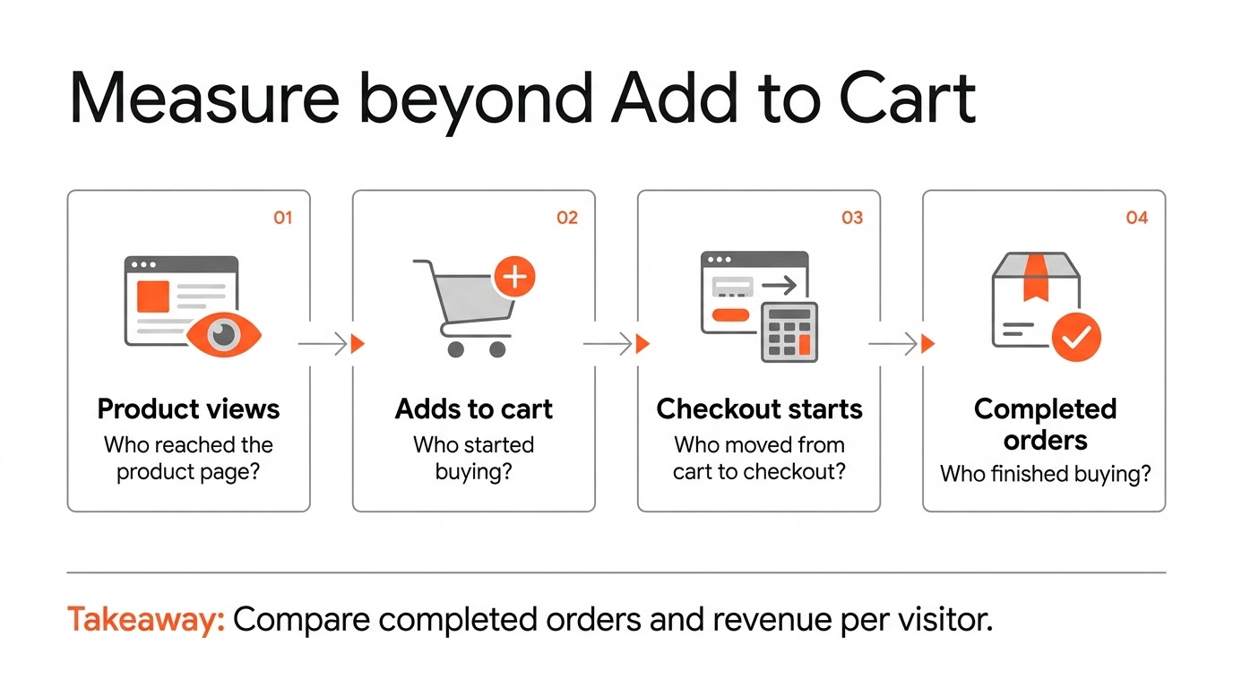
Shopify's Web Pixels API gives you standard events such as product_viewed, product_added_to_cart, checkout_started, and checkout_completed. If you use GA4, check that you've mapped those events correctly and that your tracking respects the customer's consent settings.
Important: Shopify custom pixels run in a sandbox. A script written for the storefront may expect to read the regular window.dataLayer, and that assumption may cause it to behave differently in a pixel. Use the official Shopify custom pixel and Google Tag Manager guidance when you set it up.
Test One Meaningful Change at a Time
Suppose you want to compare size buttons with a dropdown. If you can, run a controlled A/B test so comparable visitors see the two versions during the same period.
Look at what happens beyond the selector. If more people interact with the size options but fewer complete an order, the extra clicks alone don't tell you that the new design worked.
Work out how many visitors or orders you need for the test. A few orders won't reliably tell you whether the design caused a change in conversion. Keep the experiment running long enough to reach the sample size you calculated, even if the early results look good.
If the store doesn't get enough traffic to run a reliable test, fix the things you can reproduce. A variant price can be wrong, a button can fail, delivery information can be missing, or the gallery can leave out a detail customers need. You can fix those issues without claiming a percentage improvement in conversions.
Final Recommendation
The first thing I would check on a Shopify product page is whether a customer can understand what they're buying, select the right variant, see the correct price, and add it to the cart with clear feedback.
Then go through the images, shipping information, description, and mobile experience. Check what the theme already supports before you add an app.
A developer may be a better fit when you have a product with many variants, need a custom option interface, or need product information to update dynamically. Decide based on what's getting in the way on your own page. Another store's layout may solve a different problem.
Make it easier for the customer to decide whether to buy, then see what happens to completed orders and revenue as well as clicks.
If your theme or existing apps can't handle the product page changes you need, contact Scalefront and we can go through the requirements.
Sources and Further Reading
- Baymard Institute — Product Page UX Research
- Baymard — Size Selection Buttons
- Baymard — Product Gallery Thumbnails
- Shopify Help — Adding Variants
- Shopify Dev — Supporting High-Variant Products
- Shopify Dev — Product Option Value
- Shopify Dev — Section Rendering API
- Shopify Dev — Ajax Cart API
- Shopify Dev — Shopify Image Filters
- Shopify Dev — Web Pixels Standard Events
- Shopify Dev — Tap Target Size and Spacing
Frequently Asked Questions
ScaleFront Team
The ScaleFront engineering team designs and builds bespoke Shopify themes, apps, and headless architectures for scaling DTC brands.
Speak with an architect →Need Custom Shopify Architecture?
We engineer bespoke Shopify themes, private apps, and headless storefronts designed for speed and conversion.
Related Articles
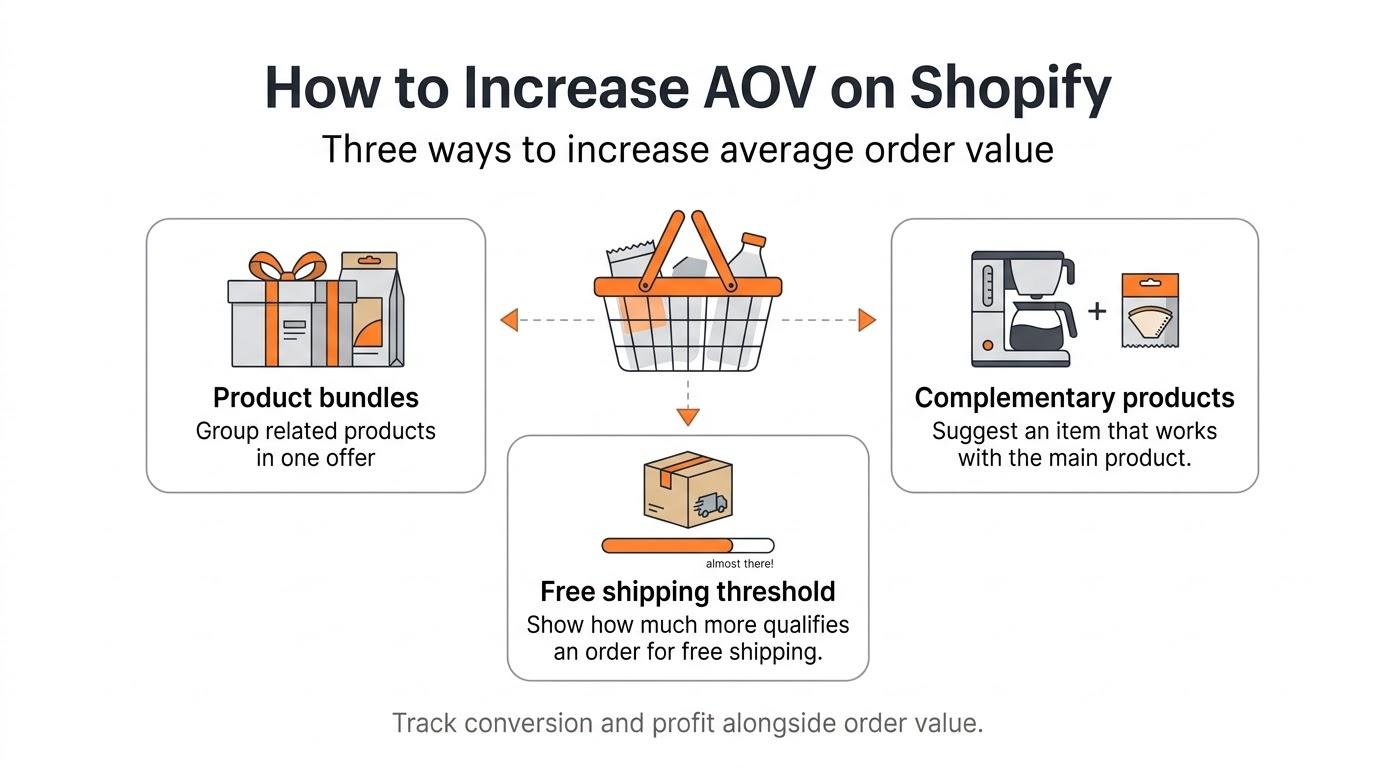
How to Increase AOV on Shopify: Practical Strategies, Apps, and Implementation
Learn how to increase average order value on Shopify using product bundles, upsells, discounts, and recommendations. Includes Shopify apps, implementation examples, and CRO measurement.
Shopify Custom Product Configurator: Apps vs Custom Development
Learn how to build a Shopify product configurator using native features, product option apps, or custom development. Covers variants, engraving, bundles, 3D previews, and pricing.
WooCommerce to Shopify Migration: Common Problems and How to Avoid Them
Learn how to avoid WooCommerce to Shopify migration problems with products, customer accounts, historical orders, subscriptions, redirects, and SEO.